Your photos are your salespeople. Sharp, honest images increase trust and conversion—especially on mobile. Here’s a simple, durable setup that makes product images look great and load fast.
Shoot once, sell everywhere: quick guidelines
- Neutral background + soft light: diffused daylight or a cheap softbox. Avoid harsh shadows.
- Consistency: same angle and crop across products. It makes grids look pro.
- Show details: 1 hero + 2–4 detail shots (texture, ports, scale in hand).
- Keep it honest: true color and no over-processing. Returns go down when expectations match.
Formats: what to use (and when)
- WebP: best general-purpose format for photos/images. Small, widely supported.
- JPEG: fallback if you need it; use quality ~80–85.
- PNG: only for transparency or crisp UI/line art (logos, diagrams).
- SVG (vectors): perfect for logos, icons, simple diagrams; scales razor-sharp and tiny file sizes.
- AVIF (optional): even smaller than WebP, but slower to encode; great for hero/larger assets if you want the smallest bytes.
Rule of thumb: product photos ? WebP (with JPEG fallback if needed). Logos/icons ? SVG. UI screenshots/flat art with transparency ? PNG/WebP.
Responsive image patterns (copy/paste)
1) Simple responsive photo (good default)
Use srcset + sizes so phones pull small files and desktops pull bigger ones. Keep width/height for zero layout shift.
<img
src="images/products/camera-800.webp"
srcset="images/products/camera-400.webp 400w,
images/products/camera-600.webp 600w,
images/products/camera-800.webp 800w,
images/products/camera-1200.webp 1200w"
sizes="(max-width:576px) 100vw, (max-width:992px) 50vw, 33vw"
width="800" height="800"
alt="Mirrorless camera front view"
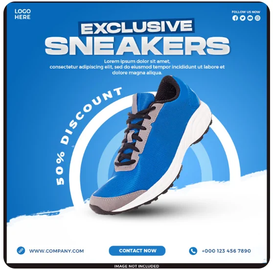
loading="lazy" decoding="async">2) Art-direction (different crops per breakpoint)
Use <picture> to swap a tighter crop on mobile and a wider one on desktop. Add AVIF/WebP with JPEG fallback.
<picture>
  <!-- AVIF sources (optional) -->
  <source type="image/avif"
          srcset="images/products/shoes-mobile.avif 480w,
                  images/products/shoes-desktop.avif 1200w"
          sizes="(max-width: 576px) 100vw, 1200px">
  <!-- WebP sources -->
  <source type="image/webp"
          srcset="images/products/shoes-mobile.webp 480w,
                  images/products/shoes-desktop.webp 1200w"
          sizes="(max-width: 576px) 100vw, 1200px">
  <!-- JPEG fallback -->
  <img
    src="images/products/shoes-desktop.jpg"
    width="1200" height="800"
    alt="Running shoes angled view"
    loading="lazy" decoding="async">
</picture>
3) Consistent grid thumbnails (no weird crops)
Wrap images in a ratio box so your catalog grid stays tidy.
<!-- CSS -->
<style>
.prod-thumb{ aspect-ratio: 4 / 3; border-radius:12px; overflow:hidden; background:#f6f8fb; }
.prod-thumb > img{ width:100%; height:100%; object-fit:cover; display:block; }
</style>

<!-- HTML -->
<div class="prod-thumb">
  <img src="images/products/bag-600.webp" width="600" height="450" alt="Leather bag front">
</div>
Performance & accessibility tips
- Largest image loads first: the main product hero should be
loading="eager"+fetchpriority="high". Thumbs/details can belazy. - Always set width & height: prevents layout shift (CLS) and stabilizes your pages.
- Use real alt text: describe the image (“Blue canvas backpack, front view”), not just “image”.
- Compress smartly: aim for <150 KB for above-the-fold photos; WebP quality ~80 is a solid start.
- SVG for logos/icons: tiny, crisp, and color-tweakable in CSS.
Common mistakes (and easy fixes)
- Uploading giant photos: export reasonable sizes (e.g., 1200px max for product hero, 600–800px for detail shots).
- No
sizesattribute: phones will download desktop files. Addsizesto everysrcset. - Missing dimensions: always include
width/heightto reserve space. - PNG photos: huge files. Use WebP/JPEG unless you truly need transparency.
Bottom line: clean, consistent photos + modern formats + responsive markup = faster pages and more add-to-carts.